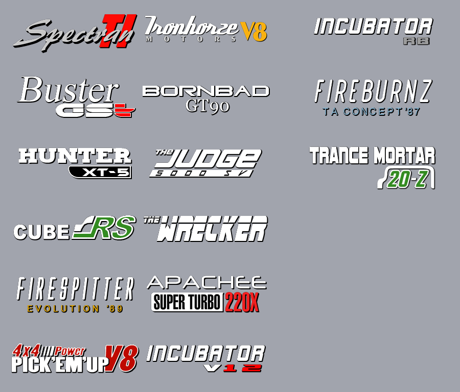
Carlogos for default cars have a consistant style to them that’s art can be replicated. But what reoccuring features there are?

From that combined picture you can already see the consistancy shown in default carlogos:
- The main car name is always in white (except the Spectran because Crashday) and everything has a 1-2 pixel shadow offset.
- You can also see the variety of fonts used, mainly that the main name’s font often differs from the miscellaneous model names next to it (great examples are the Buster’s and Bornbad’s).
- A variety of colors are used, with not that much consistancy between them, but they are always used for the model name, or at least part of it. Other colors, like blue don’t actually appear for default cars, but for your creations, a tastefully choosen color can feel just as natural as vanilla logos do (good example is the Cube’s RS, only car to use green).
- For colors other then white then sometimes you can also notice white outlines given to said shapes or letters, but only in some instances, like the Cube’s RS or the Hunter’s shape/box.
- The scale and transform of the letters can also vary. Not only some text is marked in bold or italics, you can also see the V8 being much bigger on both cars it’s displayed on, you can see the differing space between Motors‘s letters on the Ironhorze, and the V12 being squashed down on the Incubator, it’s played around with on every carlogo.
- Lastly, you can also notice simple, small shapes on some of the logos, mainly the Cube’s or Pickup’s, and it’s also used as background for other car’s letters like the Hunter’s and Apachee’s logos.
With all these in mind, and some experience, similiar logos for your (lore-friendly) cars can be created aswell!
You can see some examples on the right side of the image, all of which tried something slightly new, with still being honest to the tecniques above:
- The Incubator RB’s logo only has a new color introduced, being a darker then usual grey, while still fitting, which proves that there can be experimentation with colors not used in vanilla.
- The Fireburnz’s only elaborates on this further, intentionally looking similiar to the Firespitter’s logo, but with a still very fitting light blue as an accent color for the modelname.
- The Trance-Mortar’s tries something new in a different area, being shapes, as it uses a more elaborate, sort of text encapsulating graphic, intentionally showing similiarity to the Cube’s logo, trying to create some continuity with the two cars.
This guide mainly shows the limits of these textures, but I ultimately encourage anybody to get familiar with the lore and style behind it, and with enough creativity, try and push the style a bit more, for nice variety.