Introduction
This page serves as a guide for those wanting to recreate/replicate the textures and texturing methods used for the vanilla contents of the game.
Some of these are the exact methods Moonbyte used when creating the game, but others are merely recreating the textures with more modern and different means.
Partially, this page will refer to modelling or UV-mapping for full explanation of some methods, so some level of 3D- and image editing program skills are required.
Paint.net and Blender will be used as the default softwares here to demonstrate the methods, which more or less can be translated to other programs.
General Tips
- Most games (which includes Crashday) can most efficiently use texture that are the powers of 2, most commonly
256x256,512x512, etc.. The aspect ratio can differ from 1:1, (for ex. be512x256). The vanilla texture dimensions will be explained specifically in parts of the guide. - Looking at, and studying vanilla game files plays an essential part in understanding and replicating them, so it’s highly recommended to do so, both when starting out, or with experience, looking to refine your work.
Main Textures
body.tga
body.tga is the main paintable texture on the car.
It’s body.tex uses a diffuse enviroment map shader type, which gives it the reflective clearcoat look. The resolution is 512x512 pixels for all vanilla cars.
It can be divided into 3 main layers:
- Ambient occlusion (AO) map/texture
- Doorgaps, details
- Background Color
The Ambient occlusion texture can be baked/generated in 3D programs. It’s the natural shading the model receives, from it’s own and surrounding geometry, independent from external lighting.
The settings below provide a fast bake and a good base to work on (demonstrated in Blender 2.79):
Render tab
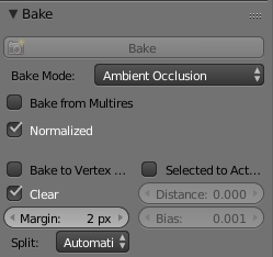
World tab
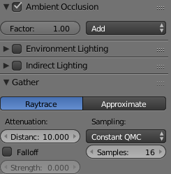
It’s recommended to bake in a 2x or 4x higher resolution (1024x or 2048x) and then downsize the image to 512x in a program of choice, to create natural anti-aliasing on the edges of UV islands and smooth off sharp edges on seemingly smooth parts (caused by normal imperfections). For these reasons, it’s also good to choose a resize type that creates the most blurry result (Bilinear or Fant, but Super Sampling can also work).
Usually, even the downsizing doesn’t make the sharp lines disappear, in which case, a type of Surface Blur needs to be used (Surface Blur named effect itself, or the Smart Blur plugin for Paint.net). For best effect, carefully finetune the Radius and Strenght values, to only blur the neceserary lines, and not get rid of smooth transitions.
It’s good to have a smooth and pronounced fade from the top of the car from the bottom, for the most vanilla effect, with the top of the car 100% bright, white (about 255 RGB) and the bottom part 50% bright, grey (about 127 RGB). Darker greys can appear for well hidden geometry, but avoid pitch black parts. Use the Brightness/Contrast adjusters for this in your program of choice.
The Doorgap layer(s) is/are self-explanatory. It has to be noted that it darkens according to AO shading in vanilla cars. The best way to replicate that effect so far, is to draw the doorgaps in a 127 RGB grey, and set the layer type to multiply. Altho this will mean that the fake, white emboss/depth effect has to be added on a seperate, in this case additive layer. You can copy the drawn lines from the multiply layer, and offset them 1 pixel in different directions depending on their position, on the additive one for this effect, but either darken their color, or set the latter layer’s opacity to about 110-120 (35%-45%), to make the effect darker. The doorgaps are always drawn with 1 pixel thickness, usually with a line tool.
Other details mean the minigun bolts (1 pixel dots), doorhandles (usually drawn with 1 pixel thickness), or small ventillation holes (like on the ‘Horze or ‘Spitter).
The Background Color is just a simple, single color fill to get rid of the transparency below all the layers above. It should be an average of the greyscale colors on the body, so a somewhat light-mid grey, in case the UV islands show it’s borders/outlines when looking at the car from a distance.
As a last step, the whole of the texture needs to be transparent to be paintable, which means giving it a fully black alpha layer. For an explanation of the alpha channel, visit the Paint.net tips and tricks page.
…TO BE CONTINUED…
")